Building Multi-Page Funnels That Feel Human
How to Create Automated Journeys That Convert Without Feeling Robotic
Most funnels fail for one simple reason: they feel like funnels.
They’re rigid. Predictable. Transactional. And worst of all, they make your audience feel like just another lead in a system.
But high-performing funnels in today’s market operate differently. They don’t feel like automation—they feel like conversation.
If you want higher conversions, longer engagement, and stronger trust, it’s time to rethink how you build multi-page funnels.
This guide will show you how to design multi-step funnel experiences that feel human, responsive, and personalized—while still being fully automated.
Why Multi-Page Funnels Outperform Single-Page Funnels
Single-page funnels aim for speed. Multi-page funnels optimize for connection and intent.
A well-built multi-page funnel allows you to:
- Segment users based on behavior and responses
- Reduce overwhelm by delivering information in stages
- Build trust gradually instead of forcing decisions
- Increase perceived personalization
- Improve conversion rates across different buyer types
Instead of asking for everything at once, you guide users step-by-step—just like a real conversation would.
The Core Problem: Most Funnels Feel Mechanical
Here’s where most businesses go wrong:
- Every user sees the exact same path
- Messaging is generic and non-adaptive
- Pages feel disconnected instead of progressive
- No acknowledgment of user input or behavior
This creates friction.
Humans expect interaction—not instruction.
The Shift: From Funnel to Guided Experience
To make a funnel feel human, you need to shift your mindset:
Stop building funnels. Start designing journeys.
A human-centered funnel:
- Responds to user behavior
- Adapts messaging dynamically
- Uses micro-commitments instead of big asks
- Feels like a dialogue, not a sequence
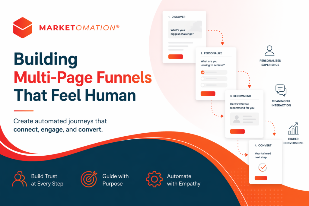
The Anatomy of a Human-Centered Multi-Page Funnel
1. The Entry Page: Context, Not Pressure
Your first page should not push for conversion—it should establish relevance.
Focus on:
- Clear problem identification
- Specific audience targeting
- A low-friction next step
Example:
Instead of “Book a Call Now” →
Use: “Let’s see if this is the right fit for you.”
2. The Qualification Layer: Ask, Don’t Assume
Introduce light interaction early.
This could include:
- Short quizzes
- Multiple-choice questions
- Guided selections
This does two things:
- Personalizes the journey
- Creates psychological investment
Key principle: Every click should feel like progress.
3. The Segmentation Engine: Tailored Paths
Once users provide input, your funnel should branch.
Use:
- Conditional logic
- Dynamic page routing
- Personalized messaging blocks
Different users should experience different funnels based on:
- Goals
- Budget
- Stage of awareness
- Industry or use case
This is where automation starts to feel human.
4. The Value Pages: Build Trust Before Asking
Instead of jumping straight to conversion, insert value-driven pages:
- Case studies
- Micro-education
- Short explainer content
- Testimonials matched to user segment
Each page should answer a specific objection or question.
Think of this as a conversation arc, not a sales pitch.
5. The Conversion Page: Contextual, Not Generic
By the time users reach your offer, it should feel like the natural next step.
Your CTA should reflect their journey:
- “Start your custom plan”
- “See your recommended strategy”
- “Book your tailored session”
Avoid generic CTAs like “Buy Now” or “Submit.”
6. The Follow-Up Layer: Continue the Conversation
A human funnel doesn’t end at conversion—or abandonment.
Use automation to:
- Send personalized follow-ups
- Reference their inputs or behavior
- Provide next-step clarity
This is where most funnels lose momentum—and where you can stand out.
Design Principles That Make Funnels Feel Human
1. Progressive Disclosure
Don’t show everything at once. Reveal information gradually.
2. Micro-Commitments
Ask for small actions instead of big decisions early.
3. Behavioral Responsiveness
React to clicks, time on page, and inputs.
4. Conversational Copy
Write like a human—not a marketer.
5. Visual Continuity
Maintain consistent design across pages to avoid cognitive friction.
Common Mistakes to Avoid
- Overcomplicating the funnel with too many steps
- Asking for too much information too early
- Ignoring user input (no personalization)
- Using static messaging across all segments
- Treating automation as a shortcut instead of an enhancement
How MarketOmation Powers Human-Centered Funnels
At MarketOmation, we specialize in building intelligent funnel systems that adapt in real time.
Instead of rigid automation, we design:
- Behavior-driven workflows
- Conditional logic pathways
- Personalized lead journeys
- Conversion-focused multi-page architectures
The result? Funnels that don’t just convert—they connect.
Final Thoughts
Automation doesn’t have to feel cold.
When done right, it becomes invisible—supporting a seamless, human experience behind the scenes.
The future of funnels isn’t faster or louder.
It’s smarter. More responsive. More human.
And the businesses that embrace that shift will outperform everyone still relying on static, one-size-fits-all funnels.
At MarketOmation, this is exactly what we build—intelligent, human-centered funnel systems designed to create real connections while driving measurable growth.