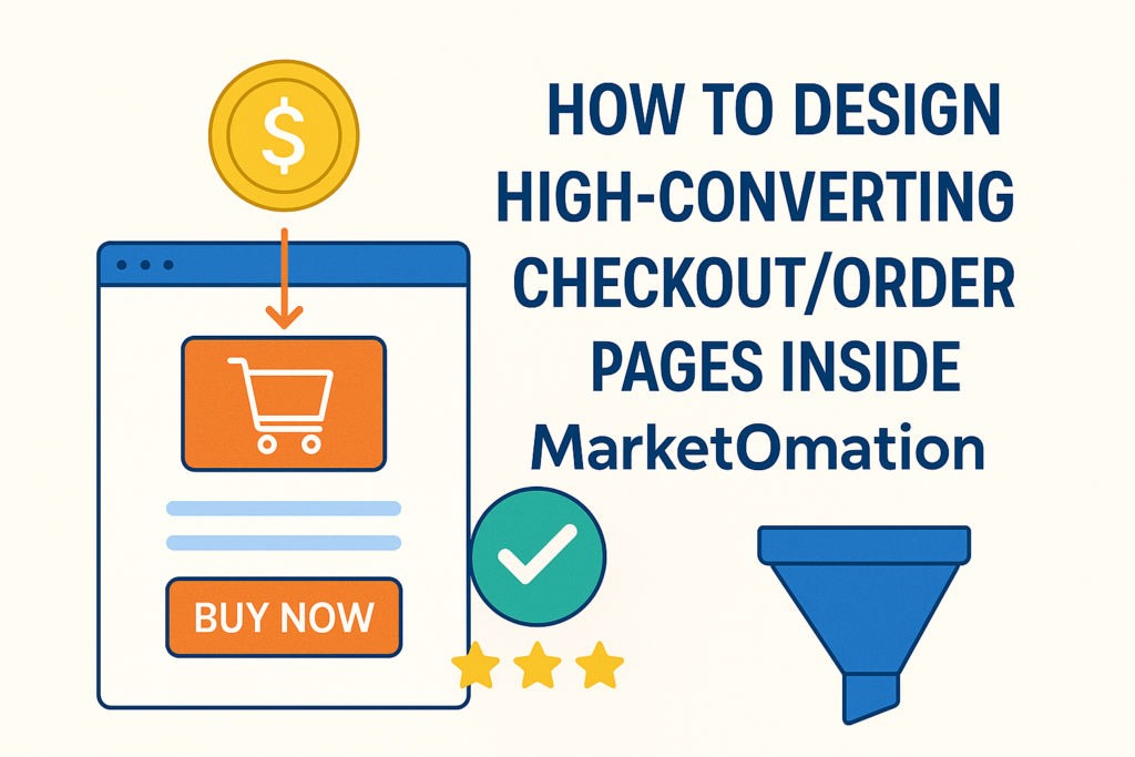
How to Design High-Converting Checkout/Order Pages Inside MarketOmation
In today’s digital marketplace, your checkout or order page is the make-or-break moment in the buyer journey. You’ve invested time and money to generate leads, nurture them, and present an irresistible offer—yet if your checkout page isn’t optimized, conversions can drop dramatically.
Inside MarketOmation, designing a high-converting checkout page is simple, streamlined, and strategically built to help service-based business owners maximize revenue. Whether you’re selling a course, membership, consultation, or digital product, this guide will walk you through the essential elements of a checkout page that converts consistently.
Why Checkout Page Design Matters More Than You Think
A checkout page is not just a form. It is a trust-building, clarity-delivering, conversion-driving tool.
A well-optimized checkout page can:
- Reduce cart abandonment
- Increase perceived value
- Improve buyer confidence
- Boost average order value
- Turn more leads into paying customers automatically
With MarketOmation’s built-in page builder and automation tools, you can create branded, persuasive order pages without needing coding, plugins, or third-party software.
Step-by-Step: How to Create a High-Converting Checkout Page in MarketOmation
1. Start With a Clean, Distraction-Free Layout
Simplicity sells.
Inside MarketOmation, choose a checkout template designed for clarity and fast decision-making.
Best practices:
- Limit navigation or remove it entirely
- Keep copy concise
- Use plenty of white space
- Make the call-to-action (CTA) highly visible
This reduces cognitive load and keeps the buyer focused on completing their purchase.
2. Showcase the Offer Value Above the Fold
Before a customer enters payment details, they want to quickly reaffirm: Is this worth it?
Highlight at the top of the page:
- The product/service title
- 2–3 bullet-point benefits
- A brief promise or transformation statement
- Social proof if available (review, star rating, testimonial snippet)
MarketOmation’s drag-and-drop builder lets you place these elements exactly where they’ll increase conversions.
3. Use Clear, Compelling Calls to Action
Your CTA button should stand out visually and communicate what happens next.
Effective CTA examples:
- “Complete My Purchase”
- “Join the Program Now”
- “Start My Subscription”
Avoid vague CTAs like “Submit.”
Inside MarketOmation, customize button color, shape, and text to match your brand while keeping high-contrast visibility for accessibility.
4. Build Trust With Proof + Guarantees
People buy when they feel safe.
Include elements such as:
- Testimonials
- Client results
- Logos of companies you’ve worked with
- A money-back guarantee
- SSL/security badge
MarketOmation allows you to upload testimonials, badges, and supporting images directly into your checkout page—no coding required.
5. Keep Form Fields Minimal
Every extra field reduces conversions by increasing friction.
Only ask for essential information—often just:
- Name
- Payment details
If you need additional info for onboarding, collect it after the purchase in a follow-up automation or onboarding form inside MarketOmation.
6. Add Order Bumps to Increase Average Order Value
Order bumps are small, relevant add-ons offered during checkout.
Examples:
- A mini-course
- A VIP upgrade
- A worksheet or template pack
- A recorded workshop
With MarketOmation, you can add one-click order bumps that instantly boost revenue—without the customer re-entering payment details.
7. Offer Upsells After Purchase (One-Click Upsells)
After checkout, you can automatically present a post-purchase upsell page.
Smart upsell ideas:
- A bundle upgrade
- A discounted coaching session
- Extended service plans
- A membership at a special rate
Because MarketOmation stores the customer’s payment details securely, the upsell becomes a frictionless one-click confirmation.
8. Optimize Your Mobile Experience
Over 60% of buyers purchase on mobile devices.
Check that your checkout page is:
- Responsive
- Easy to scroll
- Fast to load
- Has large tap-friendly buttons
MarketOmation’s templates are fully mobile-optimized, but always preview your page before publishing.
9. Add Automated Follow-Up for Abandoned Checkouts
Even with optimization, some buyers drop off.
MarketOmation allows you to set up:
- Reminder emails
- SMS prompts
- Limited-time offer sequences
- Personalized recovery messaging
This automation alone can recover 10–20% of missed sales.
10. Test, Track, Improve
A high-converting checkout page is not a one-and-done project.
Use MarketOmation to:
- A/B test headlines, CTAs, layouts, and offer positioning
- Track conversion rates
- Analyze heatmap behavior (if enabled)
- Refine based on real buyer actions
Small tweaks can lead to significant revenue jumps.
Final Thoughts: Your Checkout Page Is a Revenue Engine
Designing high-converting checkout and order pages inside MarketOmation doesn’t require tech expertise—just strategy, simplicity, and the right tools.
With streamlined templates, automations, order bumps, upsells, analytics, and brand customization, MarketOmation empowers service-based business owners to create checkout experiences that turn more leads into long-term customers.
If you’re ready to transform your checkout page into a conversion machine, MarketOmation gives you everything you need—without extra software or monthly add-ons.